Case Study #1: Tires & Car Care Redesign .
How can we assist car owners of both older and newer models in making their car ownership experience easier while also enhancing engagement and conversion?
My role: UX Manager
My team: 2 UX Designers, a UX writer
My partners: UXR, Senior Product Manager, Associate Product Manager, Front End Dev Lead, Data Dev Lead
Stakeholders: Director of Auto Testing, Associate Director of Auto Testing, UX Director, Senior Director of Product and Design, SEO team, Brand Creative Director.

Executive Summary
As the UX Manager, I led a project aimed at reimagining our Tires and Car Care page to enhance its usefulness for clients and better integrate it with the overall site experience. One of our primary objectives was to clarify the benefits of this page for non-members, thereby encouraging membership sign-ups to boost our conversion rates and customer acquisition.
To achieve this goal, I managed a talented team consisting of two UX designers and one UX copywriter. We collaborated closely with User Experience Research (UXR), the Senior Product Manager, the Associate Product Manager, and leads from Front-End Development and Data Development.
By the end of the project, we expected to see improved user interaction with the Tires and Car Care page, a higher number of memberships, and increased traffic to car ownership pages, ultimately contributing to the company's overall success.
Responsibilities
Organized the team to compile existing research and market insights to inform the redesign process.
Encouraged designers to engage in extensive secondary research and observe car owner behavior on platforms like Reddit and other forums.
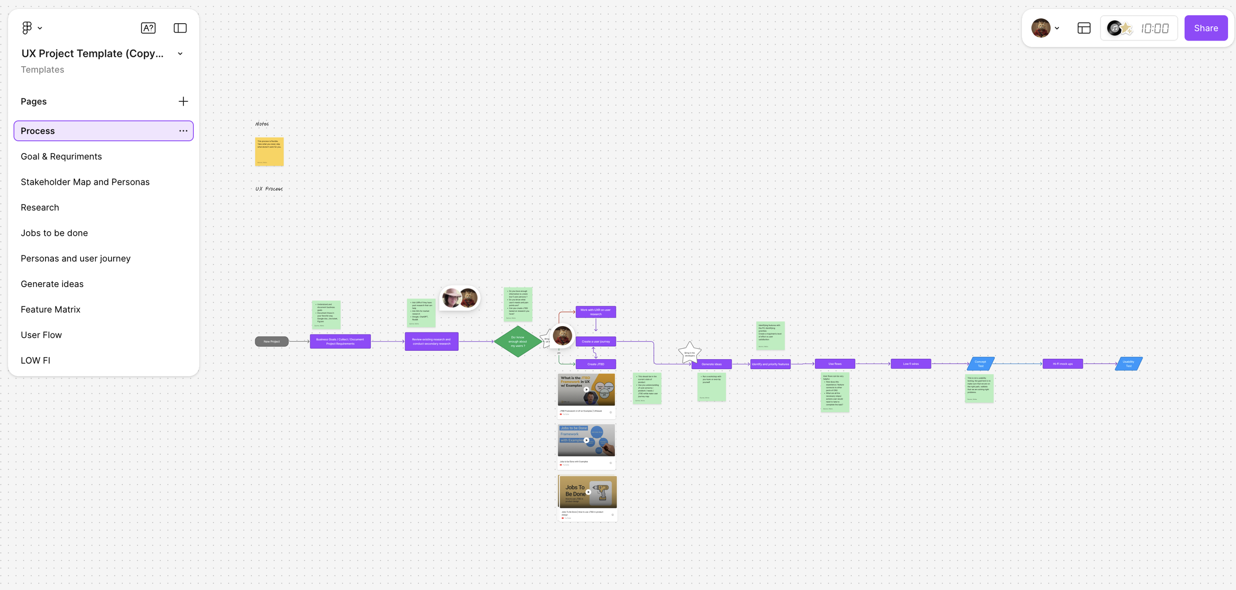
Ensured adherence to the design process by creating a FigJam template for designers to use as a guide throughout the project.
Led stakeholder meetings to gain a clear understanding of business goals and objectives.
Assisted the team in identifying gaps in user research and provided constructive feedback on the user research plan.
Guided designers and copywriters throughout the redesign process, offering support to eliminate any blockers they encountered.
Project Background
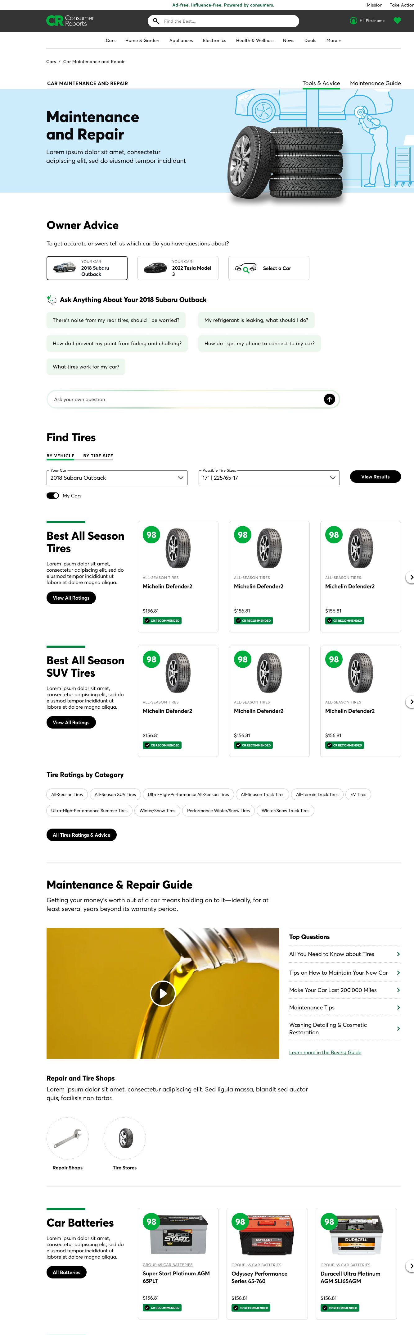
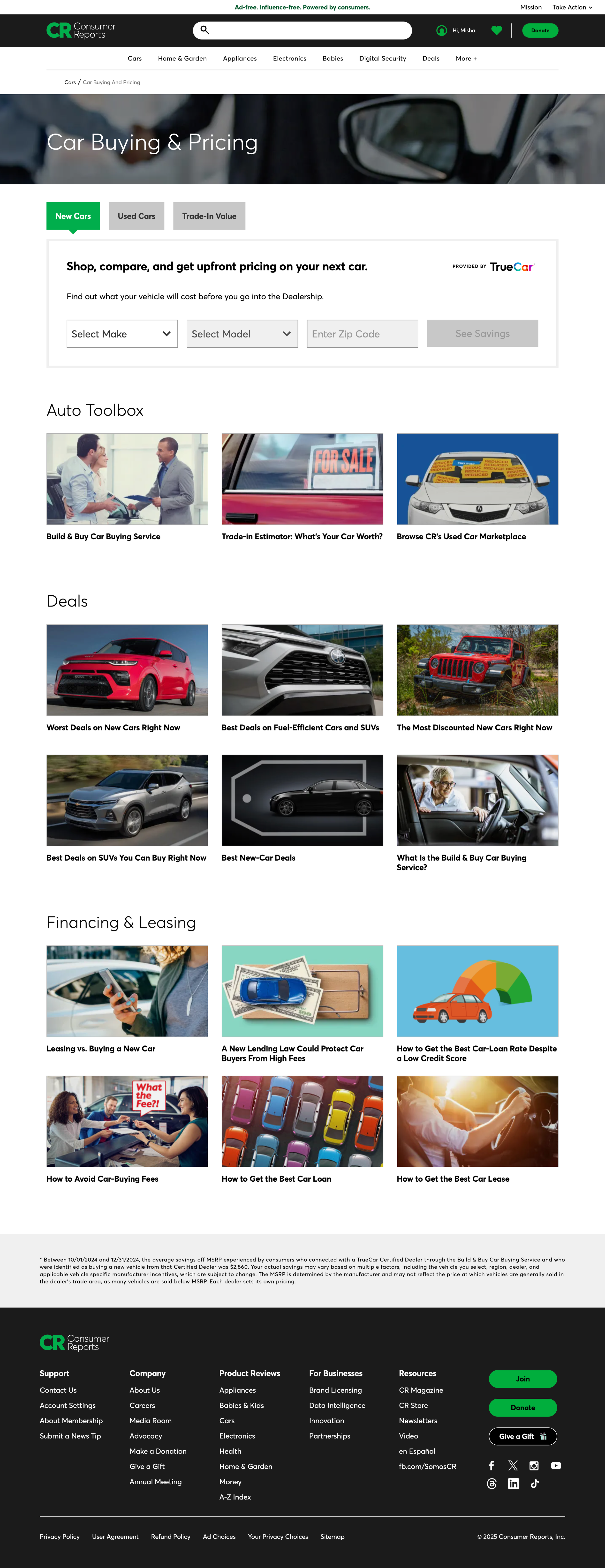
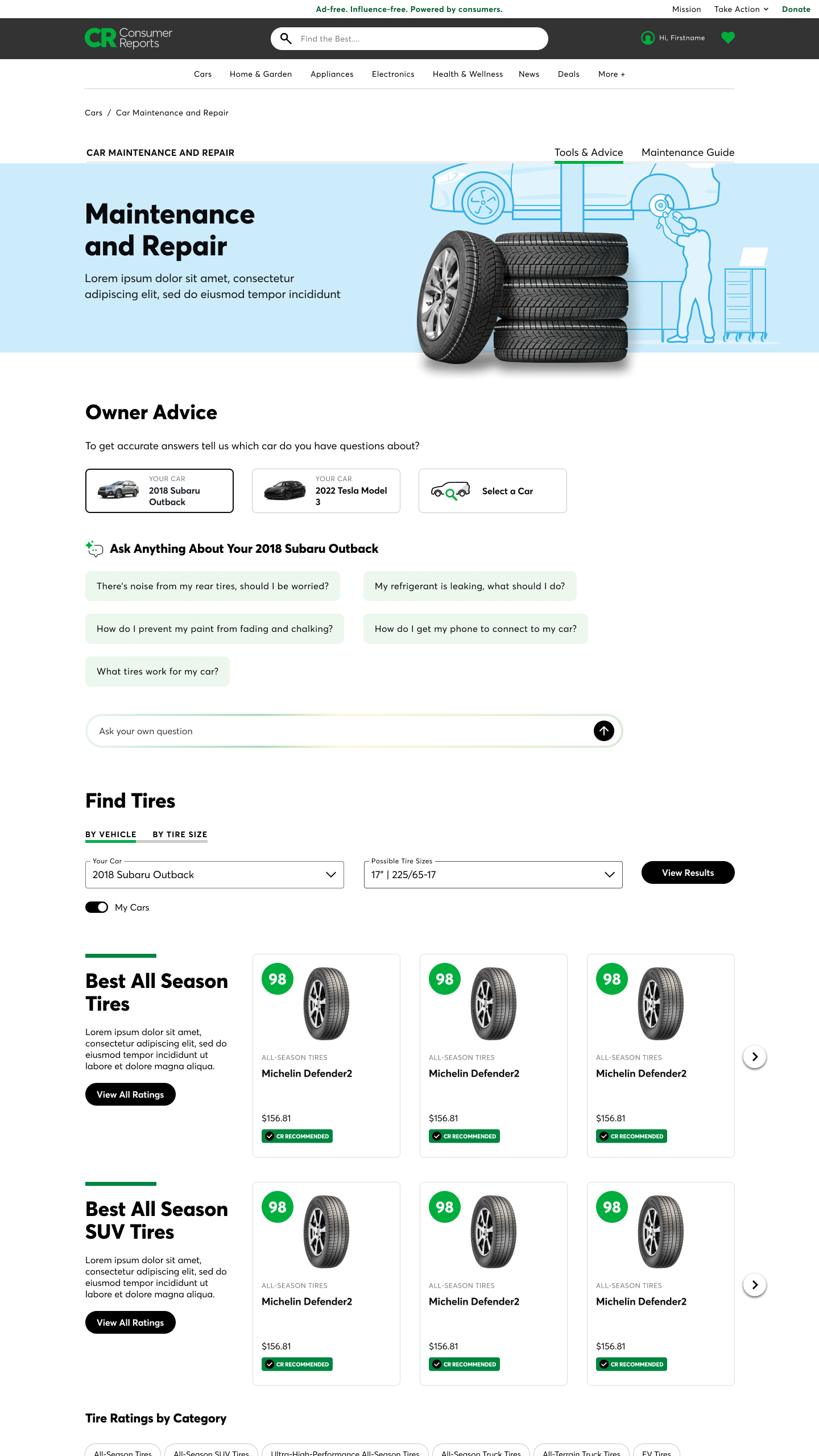
The Tire and Car Care page has been a crucial component of our online platform, initially developed in partnership with Repair Pal. However, over the years, this collaboration has not yielded the expected results. The integration of Repair Pal was intended to provide users with a seamless way to find tire and repair services. Still, we have identified significant challenges that have hindered its effectiveness and overall user satisfaction.
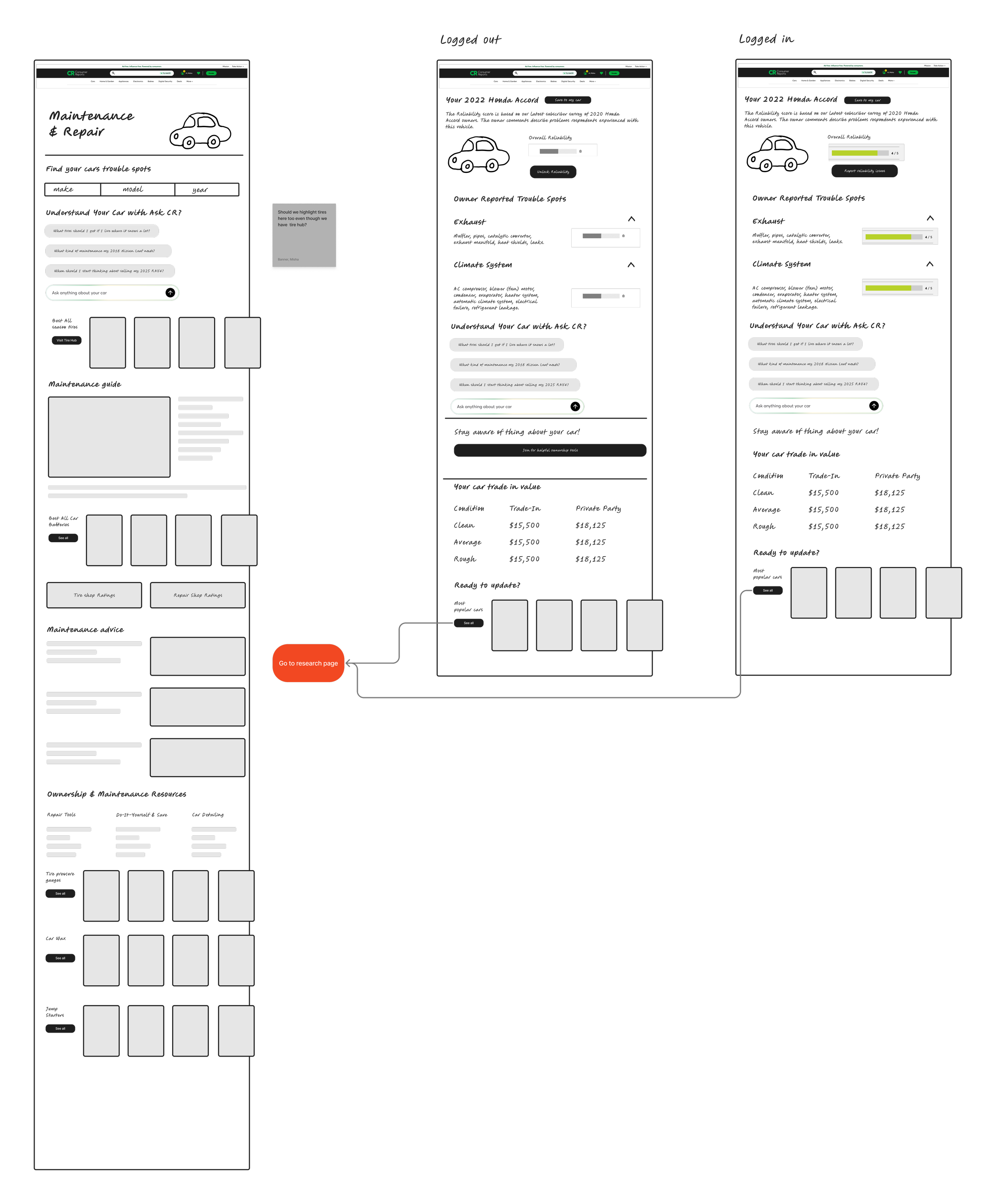
One of the main issues was that the Repair Pal tool was made available in front of the paywall, which limited the incentive for users to convert into paying customers. Even though the tool was accessible for free, it didn't drive conversions or encourage users to engage with the platform more meaningfully. This resulted in a missed opportunity to leverage the tool as a member benefit and foster greater interaction with our audience.
Additionally, user-centric research revealed that the functionalities of the Repair Pal tool were misaligned with the actual needs of our audience. The tool required users to specify the exact repairs needed before directing them to a repair shop. However, many users are often unsure of what is wrong with their vehicle and prefer to consult with a mechanic first. This user behavior renders the tool less useful, as it assumes prior knowledge that many users lack. Consequently, by the time users require assistance, they are already at the shop and do not need help finding one.
Given these insights, it has become clear that a redesign of the Tire and Car Care page is necessary.
KPIs
Increase visits to ownership pages by 20% (YTD, only 680 users visited ownership pages)
Increase conversion rate by 10%
Increase visits to Car Care and Tire-related articles by 10%
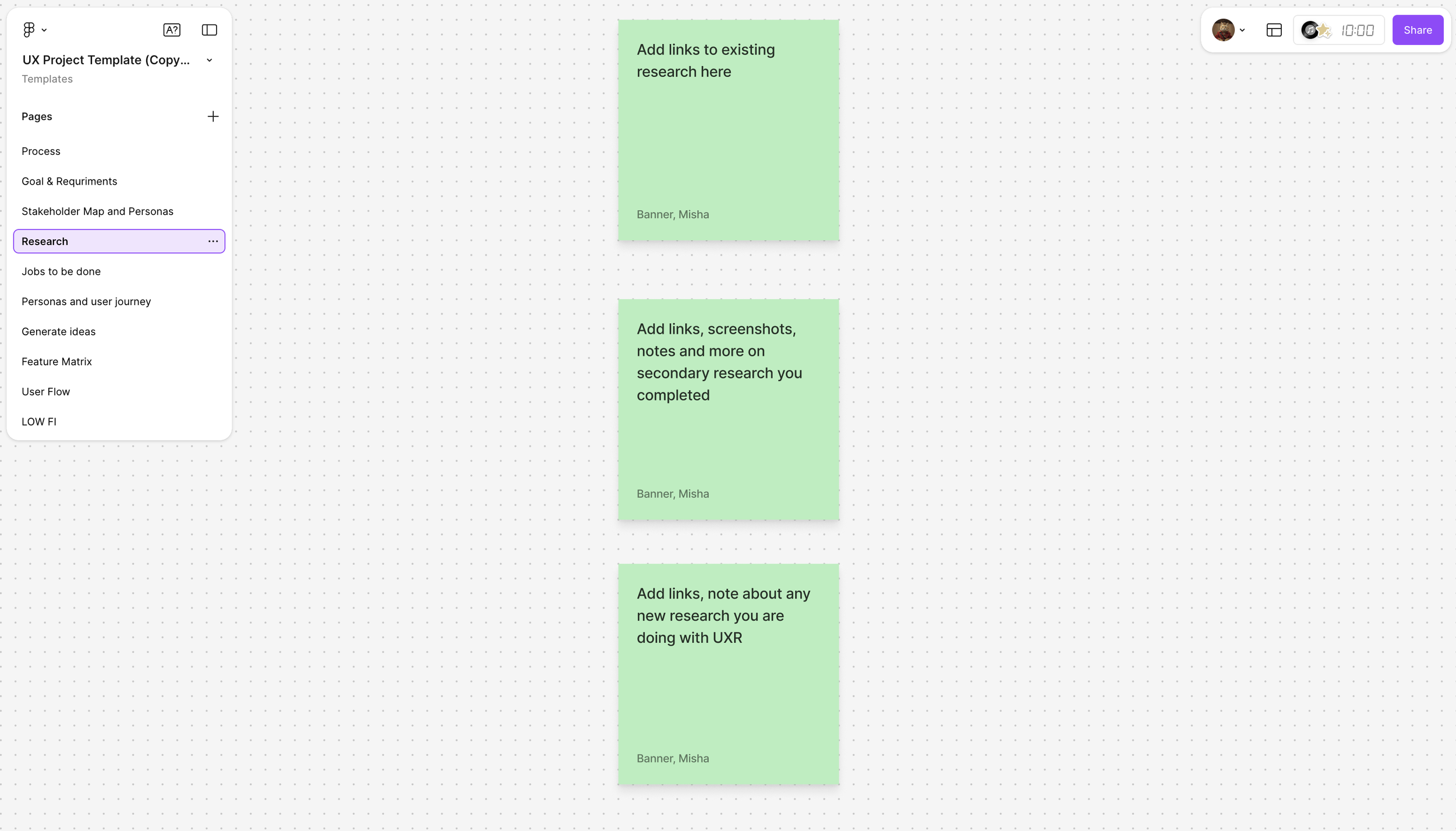
Research
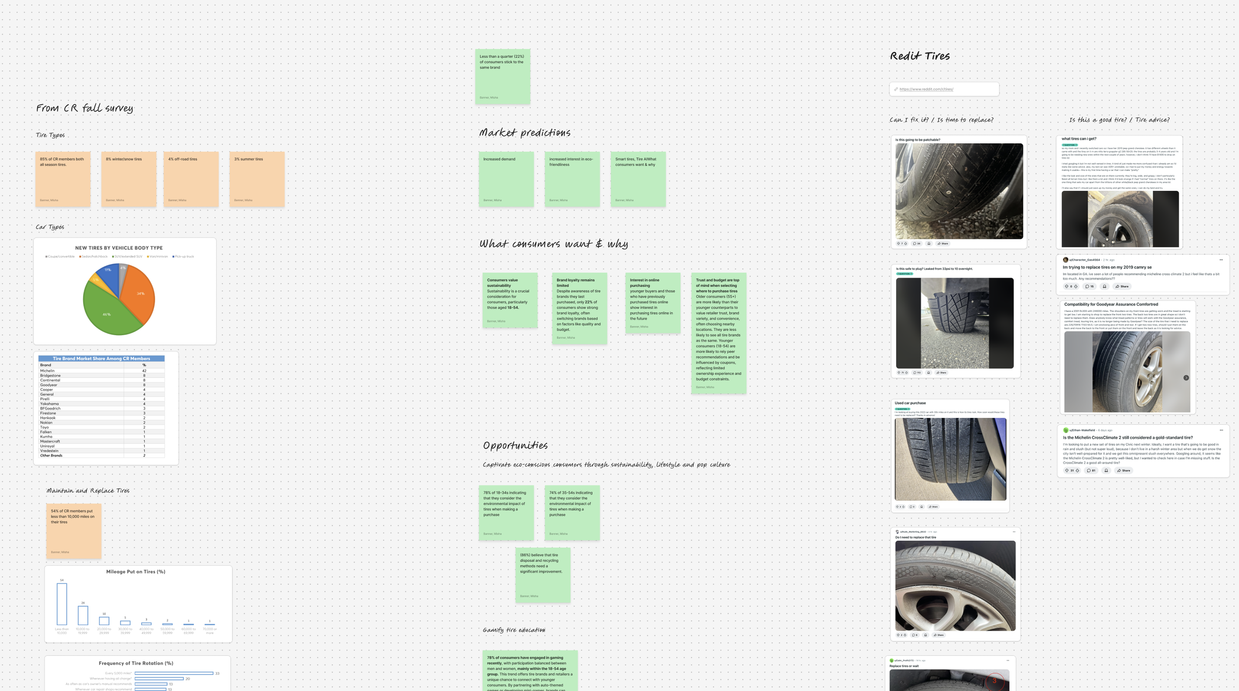
For the Tires and Car Care redesign project, we undertook comprehensive research to understand the challenges faced by car owners. I encouraged the team to explore existing studies, which led us to research conducted by an innovation team examining the experiences of car owners with vehicles ranging from brand new to 7 years old. Their findings revealed that these owners experienced relatively few challenges. To enrich our understanding, we reached out to our marketplace researcher, who provided us with extensive research documents. We also analyzed surveys from Consumer Reports sent to their members.
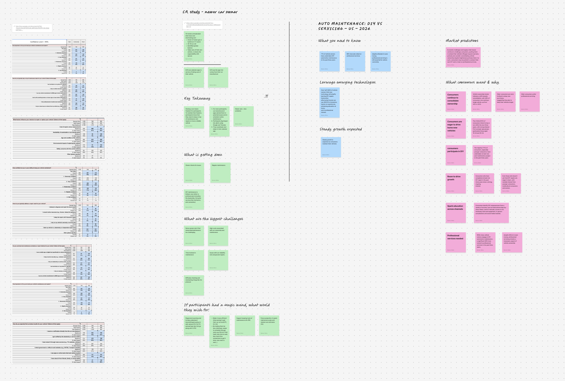
Key insights indicated:
With rising car prices, many individuals are holding onto their cars longer, leading to an average vehicle age of 12 years on the road.
Additionally, the increasing prevalence of remote work is driving households to transition to a one-car model.
Notably, we discovered a general lack of brand loyalty in car care and tire services.
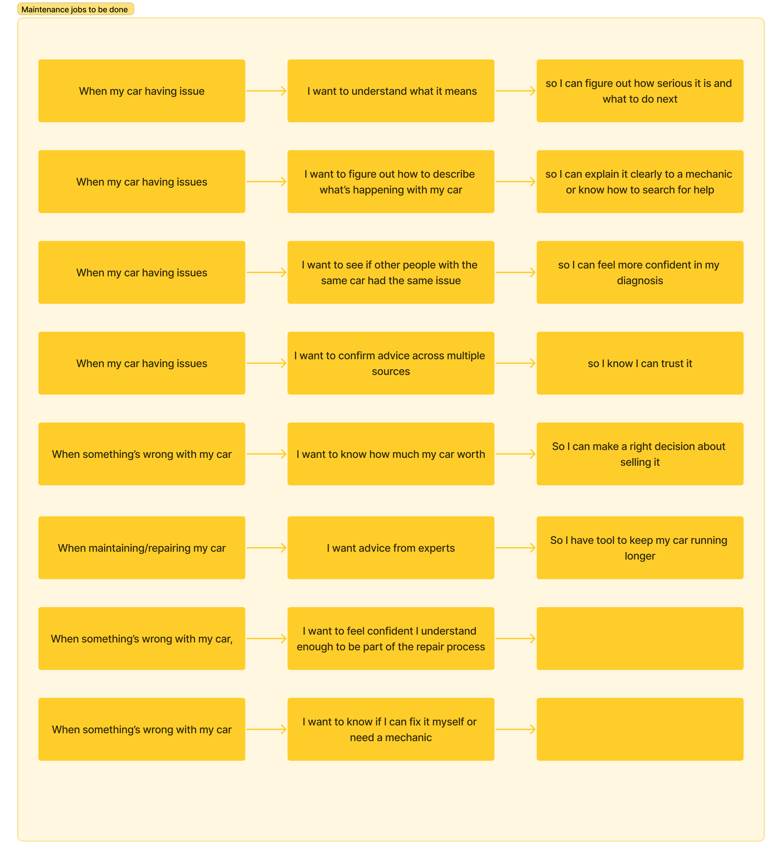
Recognizing a significant gap in our understanding of older car owners (seven to twenty years old), my team collaborated with the user experience research (UXR) team to create a test plan that involved interviewing six individuals.
These interviews revealed:
While owners had a solid grasp of routine maintenance and did not find it particularly challenging, difficulties arose during repairs.
The most significant obstacle was diagnosing issues; many respondents relied on online forums and sites like carcomplaints.com to identify problems faced by other owners.
A common frustration expressed by users was paying for repairs only to discover later that a recall covered the issue.
This highlighted the need for more effective communication and support for older car owners navigating maintenance and repairs.
Solution
Solution
Before my tenure as the UX Manager at Consumer Reports, the design culture was primarily UI-focused. Projects were often approved by creating screens one at a time without considering the holistic user experience across the entire site. This fragmented approach led to inconsistencies and missed opportunities to enhance user satisfaction.
The challenge was to shift the design mindset from a UI-centric approach to a user-centric one. It was essential to unify the design process and ensure that every project reflects the needs of our diverse user base.
To initiate this transformation, I encouraged my team to take a step back from their individual Figma design files and re-evaluate our projects through a user-centric lens. We focused on defining our users more clearly and understanding their unique needs.
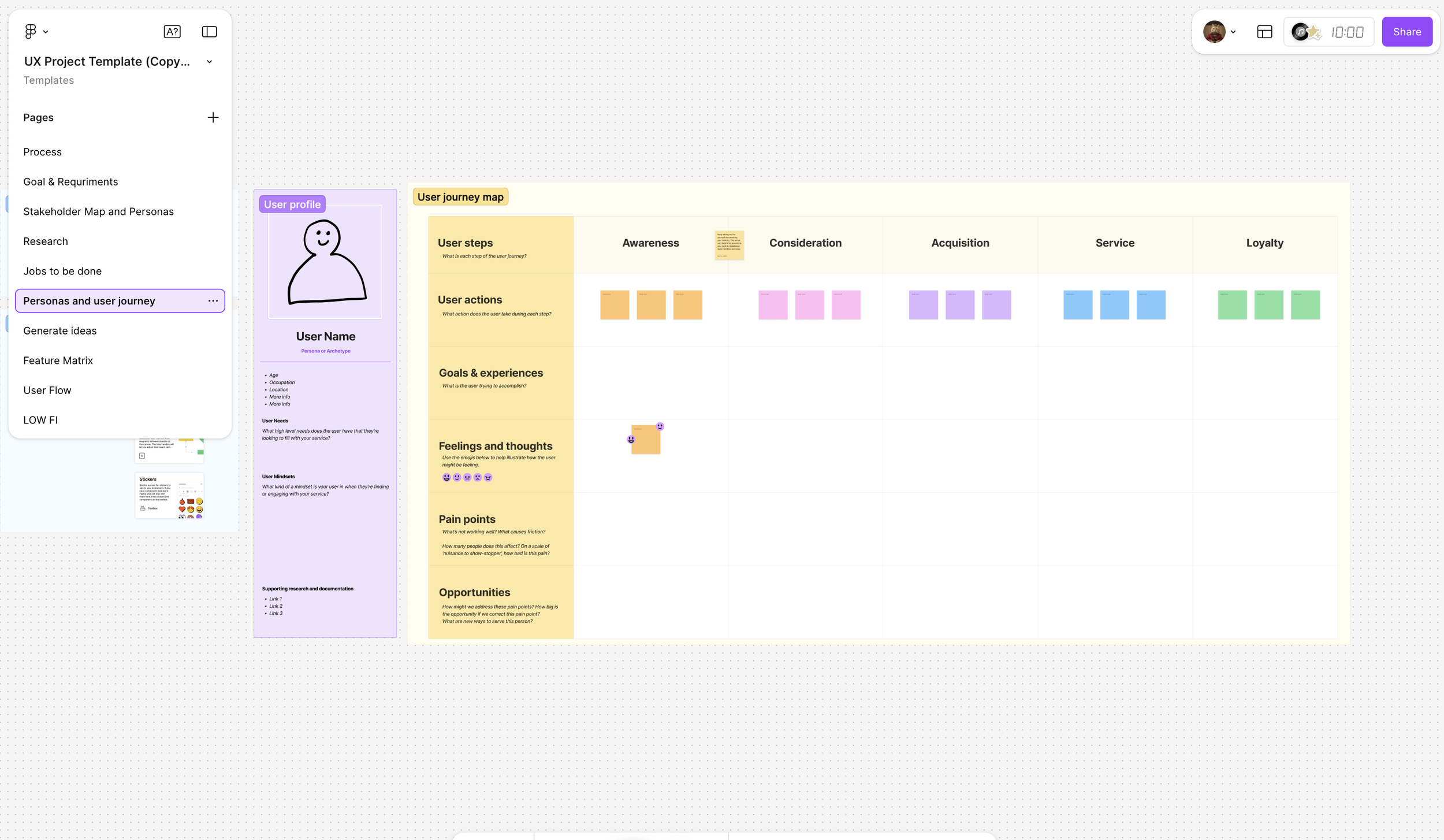
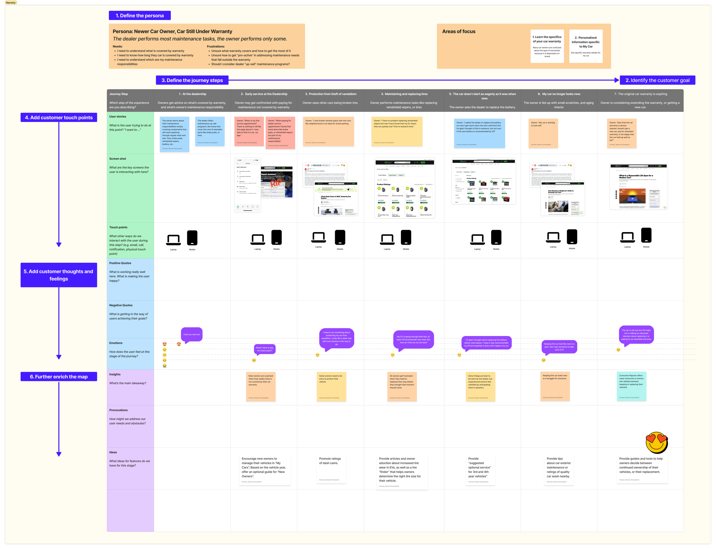
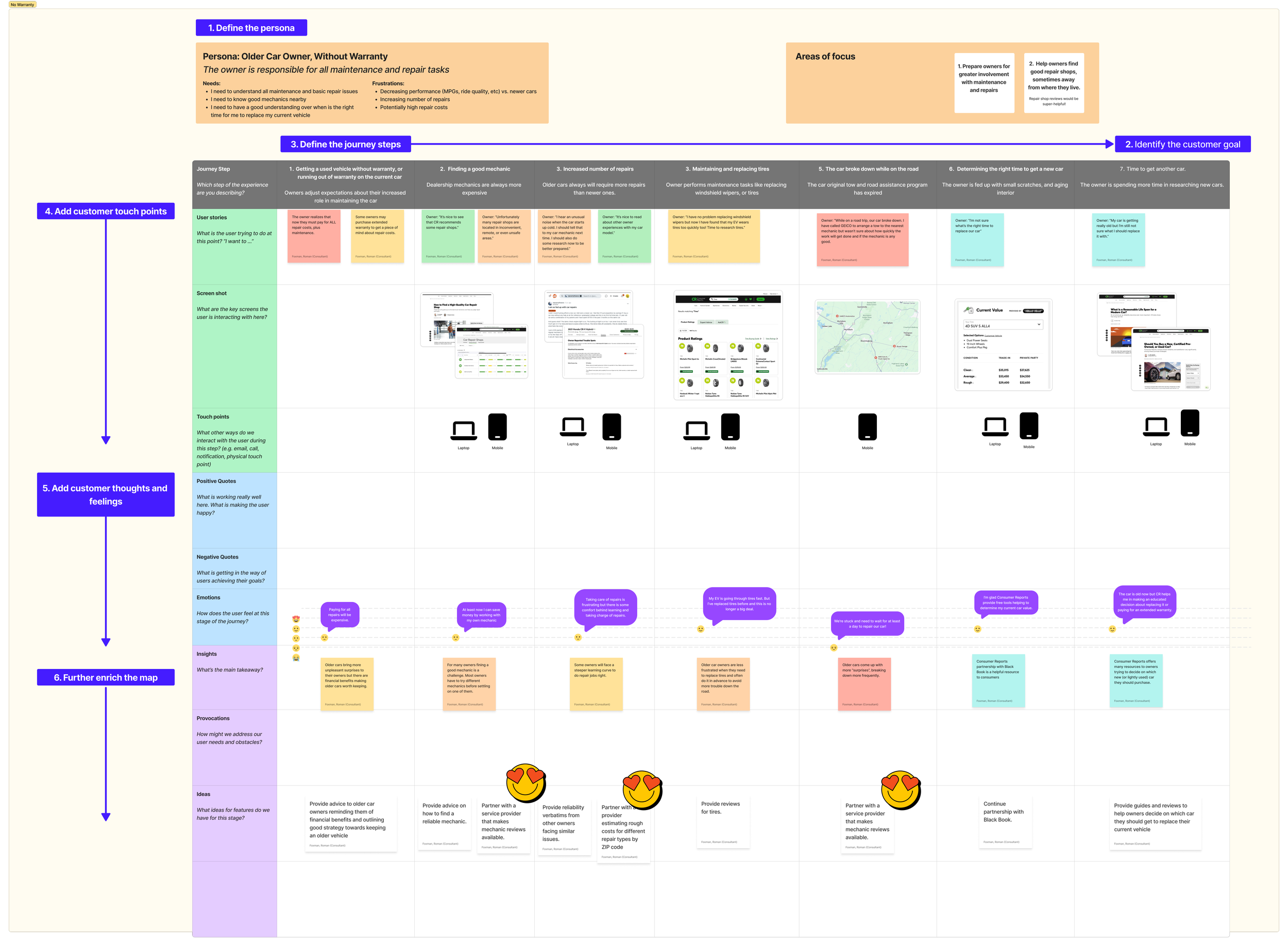
1. User Identification: My team conducted thorough research to identify two primary user personas: owners of new cars and owners of older cars. We discovered that these groups had distinct requirements, motivations, and pain points, which necessitated tailored design solutions.
2. Job To Be Done (JTBD): Collaborating with User Experience Researchers (UXR), we developed JTBD statements for each user type. This framework helped us to focus on what users are trying to achieve rather than just what they are clicking on.
3. User Journeys: The design team created user journeys to map out various interactions users might have with our site. This exercise allowed us to identify critical touch points and pain areas in the existing experience where users faced challenges.
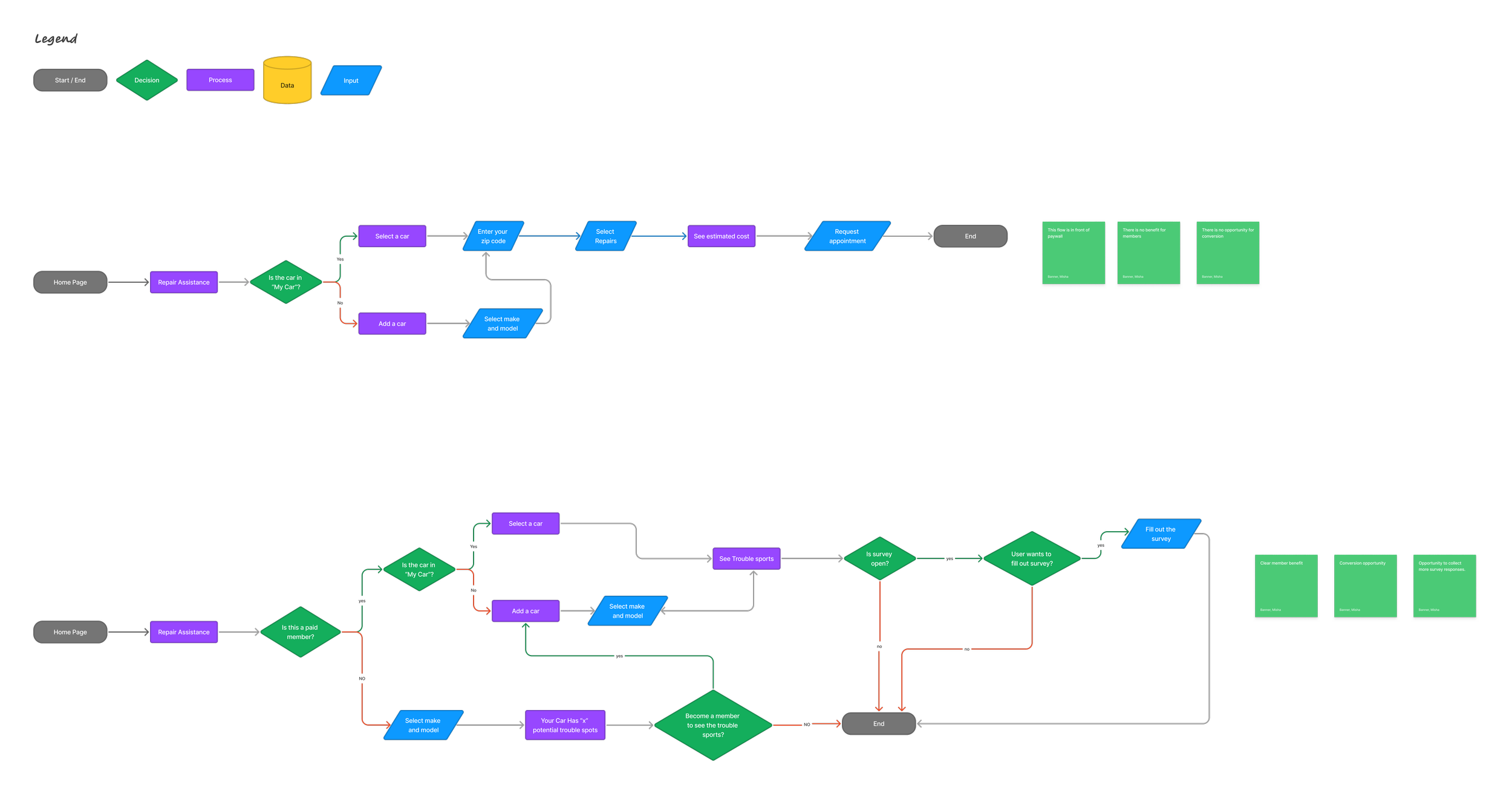
4. Collaborative Wireframing: To ensure cohesive communication and clarity, UX designers partnered closely with UX copywriters while building low-fidelity wireframes. This collaboration ensured that our designs were not just visually appealing but were also contextually appropriate, effectively communicating value to the users.
5. Iterative Feedback and Testing: Throughout the design process, we engaged in iterative user testing sessions to gather feedback. This feedback loop was crucial in allowing us to refine our designs and ensure that they aligned with users' needs.
Outcome
This user-centric approach led to a richer, more cohesive user experience across our platform. By stepping away from a purely UI-centered perspective and embracing a holistic understanding of our users, we were able to create a more integrated design that bridged gaps across different sections of the site. The positive changes were evident in user engagement metrics and feedback, showcasing the success of our shift in design culture.
Conclusion
The transformation of the design culture at Consumer Reports from a UI-forward to a user-centric methodology not only improved our design outcomes but also fostered a collaborative spirit within the team. By prioritizing the users and their experiences, we were able to create designs that resonate better with our diverse audience, ultimately driving higher satisfaction and loyalty.