Case Study #2: Car Research Page.
How can we assist a car shopper who hasn't decided on a make and model yet in finding a car that fits their lifestyle and budget?
My role: UX Manager
My team: UX Lead, 2 UX Designers, a UX writer
My partners: UXR, Senior Product Manager, Associate Product Manager, Front End Dev Lead, Data Dev Lead
Stakeholders: Director of Auto Testing, Associate Director of Auto Testing, UX Director, Senior Director of Product and Design, SEO team, Brand Creative Director.
Executive Summary
As the UX Manager on this project, I led our team in a comprehensive analysis of the consumer experience within the CRO car space, particularly focusing on a demographic that remains largely underserved: car shoppers who are unsure of their specific vehicle choices. Our research highlighted a critical gap in the market—individuals entering the car-buying journey without a clear understanding of the make or model they desire.
Recognizing this pain point, we delved into the motivations and needs of these users, discovering that, although they may lack decisive preferences on the type of car, they possess nuanced lists of desired features, preferences, and budget constraints that significantly influence their decision-making processes.
Our project aims to empower potential car buyers with tools and insights that facilitate informed choices, ultimately transforming an uncertain car shopping experience into a more engaging and user-centric journey. By addressing the needs of this underserved segment, we anticipate not only improving user satisfaction but also driving higher conversion rates in the car-buying process.
Responsibilities
Organized the team to compile existing research and market insights to inform the redesign process.
Encouraged designers to engage in extensive secondary research and observe car owner behavior on platforms like Reddit and other forums.
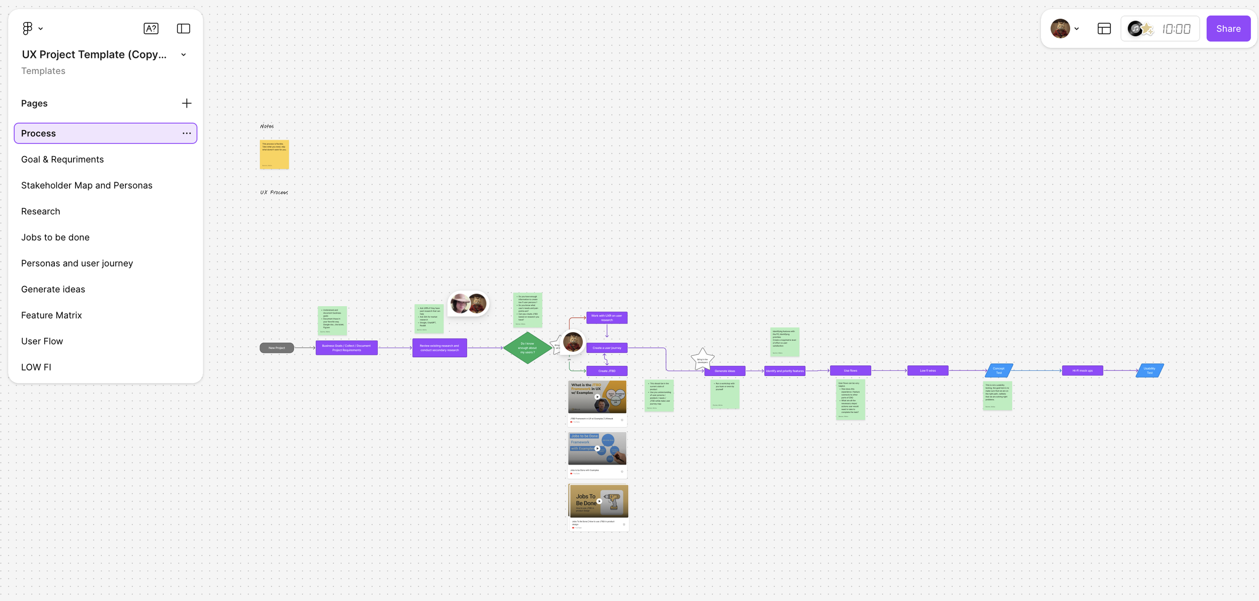
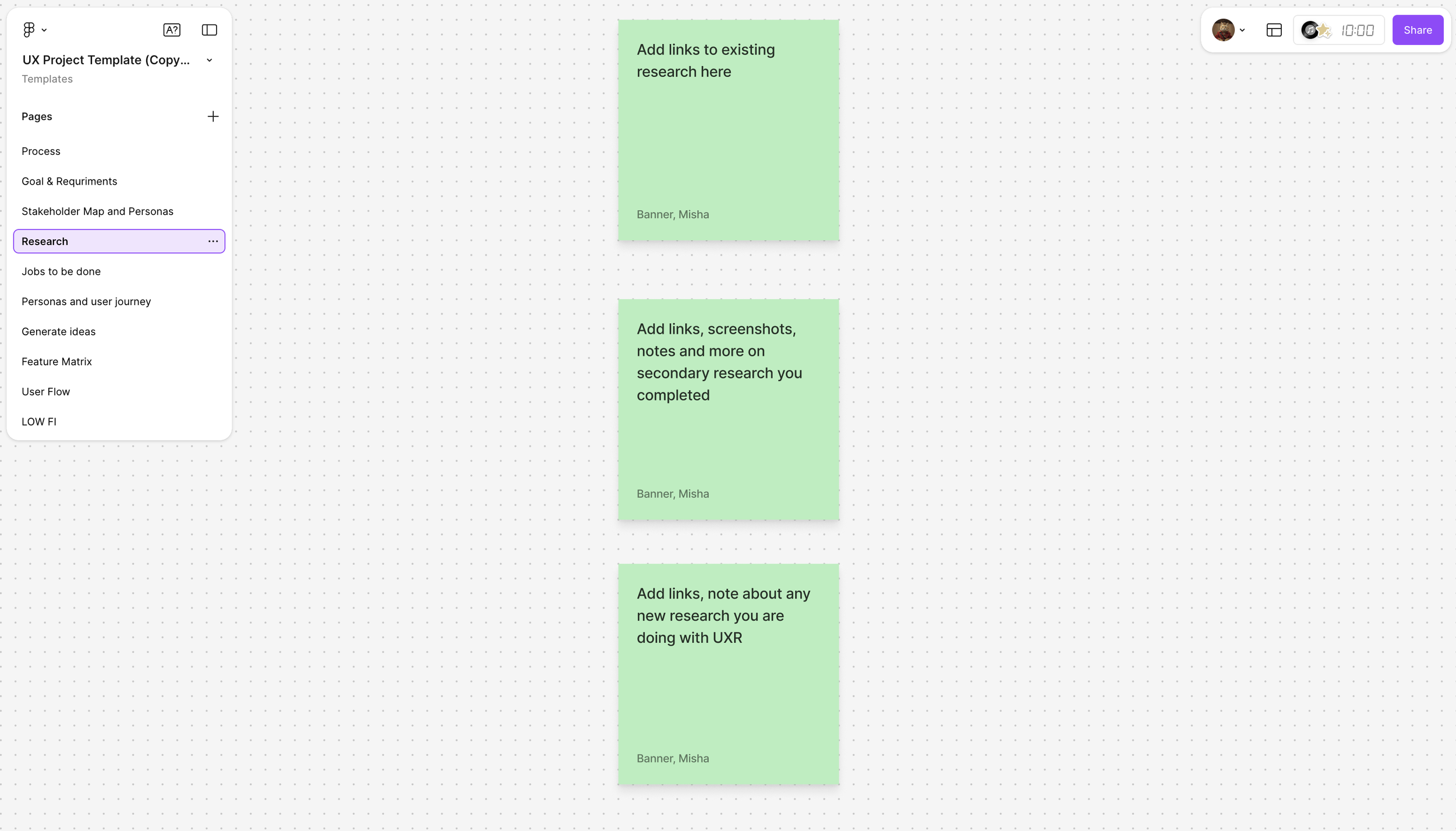
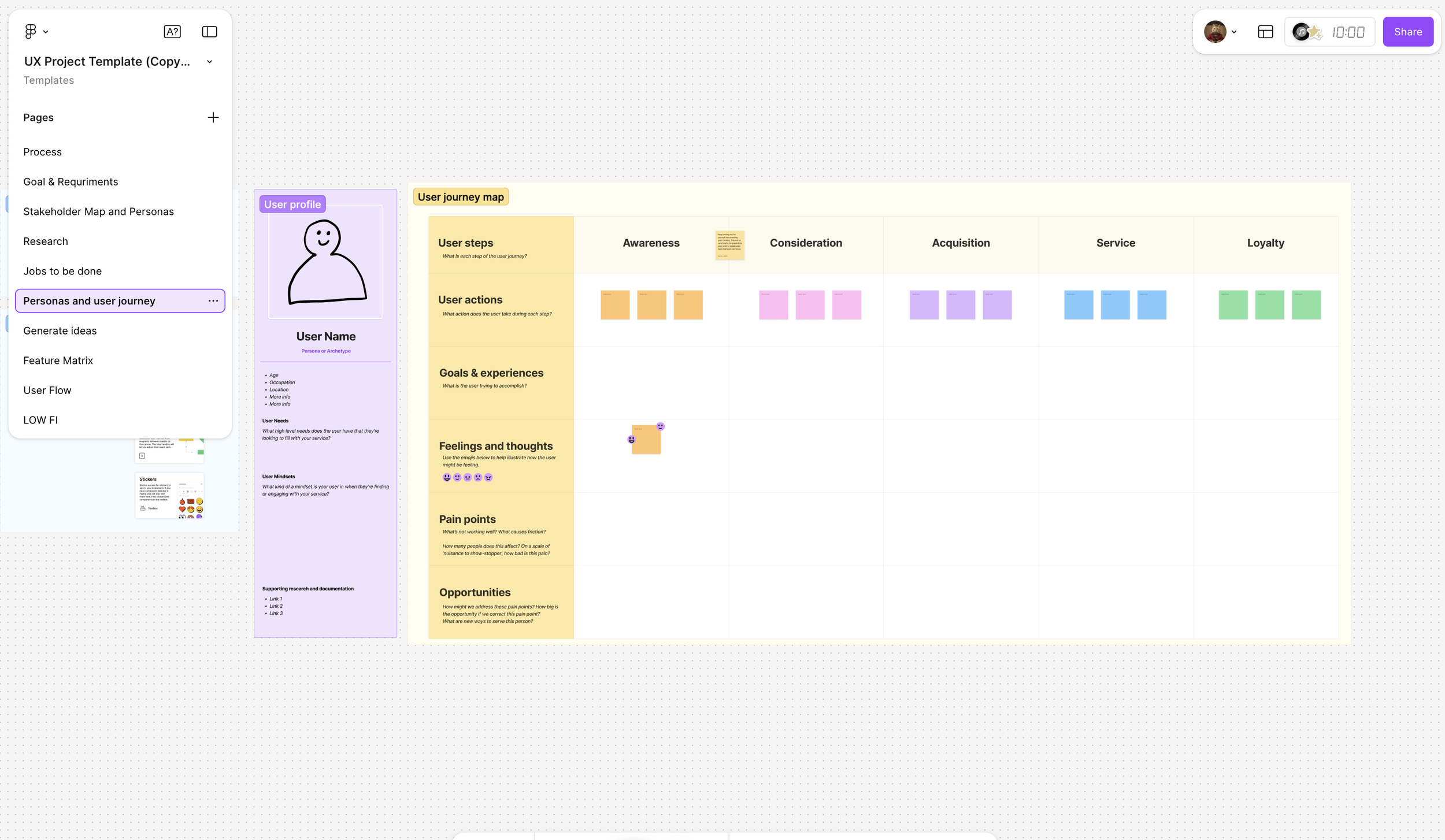
Ensured adherence to the design process by creating a FigJam template for designers to use as a guide throughout the project.
Led stakeholder meetings to gain a clear understanding of business goals and objectives.
Assisted the team in identifying gaps in user research and provided constructive feedback on the user research plan.
Guided designers and copywriters throughout the redesign process, offering support to eliminate any blockers they encountered.
Project Background
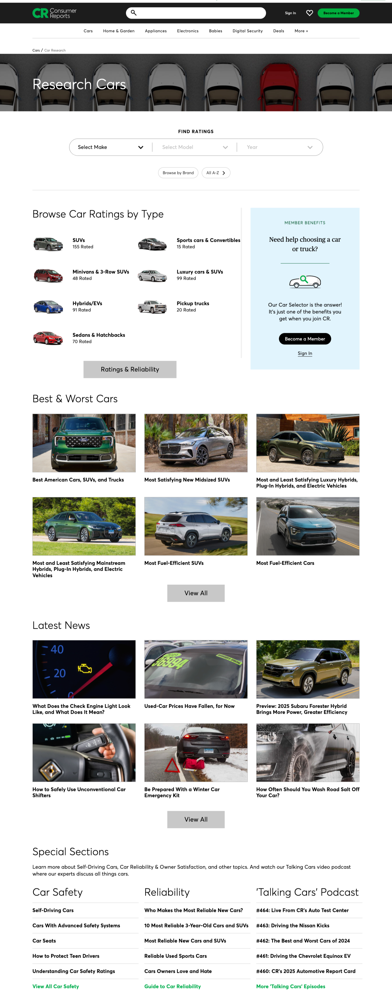
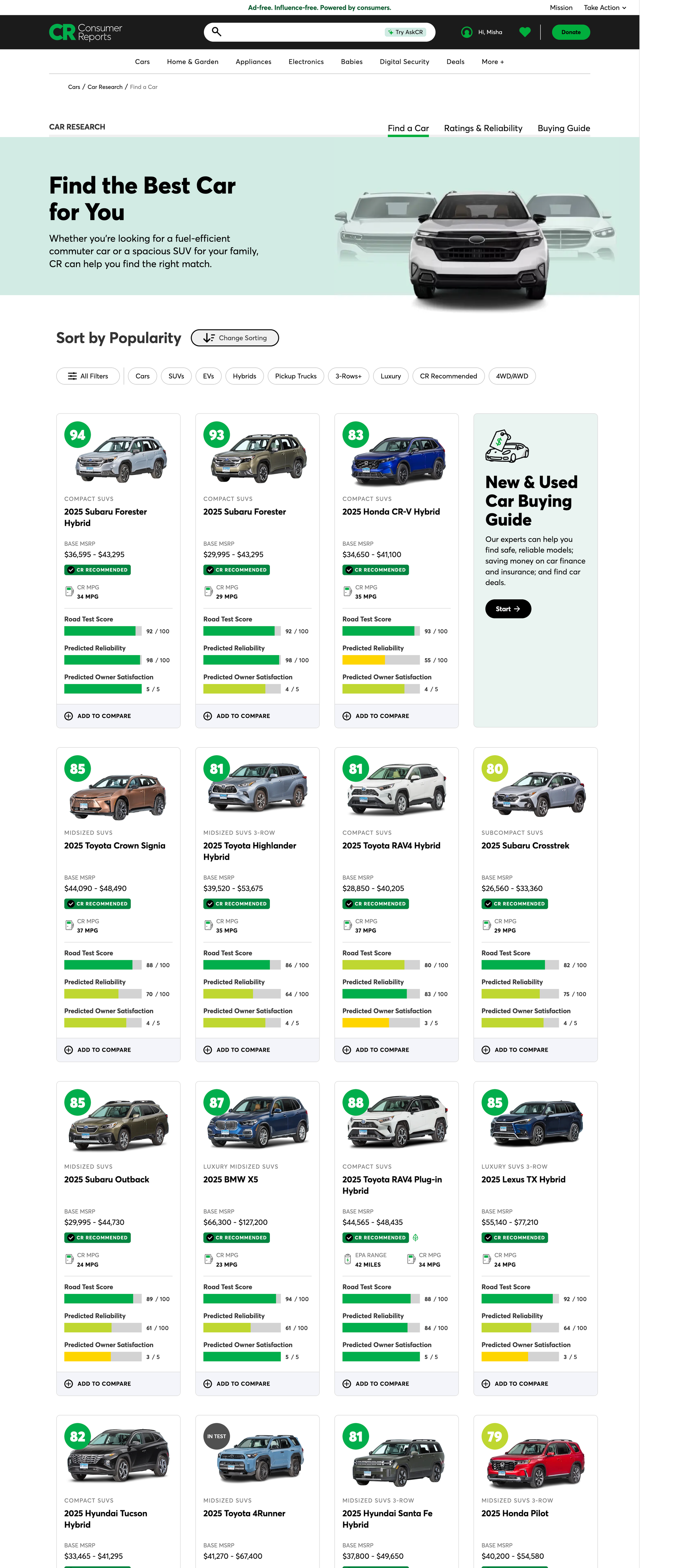
As the UX Manager for the Car Research page project, I was tasked with addressing challenges related to user engagement and overall page performance. The Car Research page had been established as a resource for users seeking detailed information about various vehicles. While it shared similar functionality with the main Cars page, the user interface (UI) presented noticeable differences that did not align with users' expectations and needs.
Despite attracting significant traffic from both external and internal sources, the Car Research page was experiencing high bounce rates and low engagement levels. This indicated that users were arriving on the page but found it not compelling enough to explore further, leading to premature exits. Given the importance of converting this traffic into meaningful interactions and value for our users—especially for those who are members of the Car Research community—we identified a clear opportunity for improvement.
Our aim was to refine the UX strategy for the Car Research page, enhancing its functionality and visual design to create a more cohesive and engaging experience. By leveraging insights from user data and feedback, we aspired to transform this platform into a more effective tool for our users. Ultimately, we sought to foster deeper engagement and ensure that the page maximized its potential to serve the needs of both casual visitors and dedicated community members.
KPIs
Increase Time Spent by 20%
Increase Interaction, especially with Add to Compare, View Compare, and linking to Ratings Chart by 30%
Research
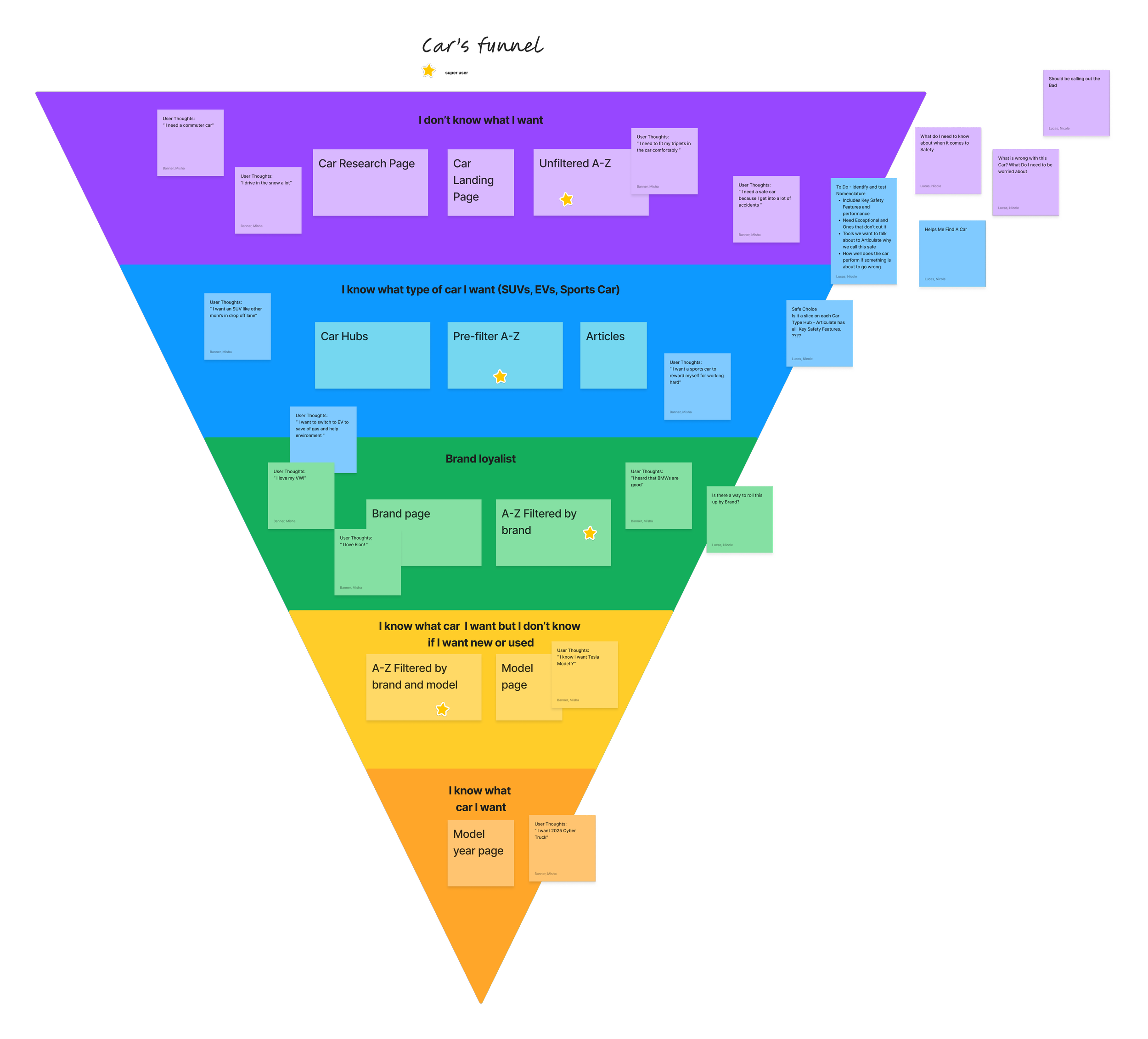
As the UX manager responsible for the redesign and relaunch of the Car Research (CR) page, my primary goal was to ensure that our design decisions were rooted in user insights. Our journey began with an initial framework developed by my design team in collaboration with product managers. We outlined a car shopper funnel that categorized users based on their level of knowledge and commitment in the car buying process. The funnel included four distinct groups:
Shoppers who are uncertain about what they want but have specific requirements or a budget in mind.
Users with a clear idea of the type of car they desire (e.g., hatchback, SUV, truck).
Brand loyalists who are committed to a particular brand.
Users who know the specific make and model they want.
To validate this funnel, we engaged with the User Experience Research (UXR) team to test our hypotheses and better understand the distribution of car shoppers across these categories, specifically comparing CR members to non-members.
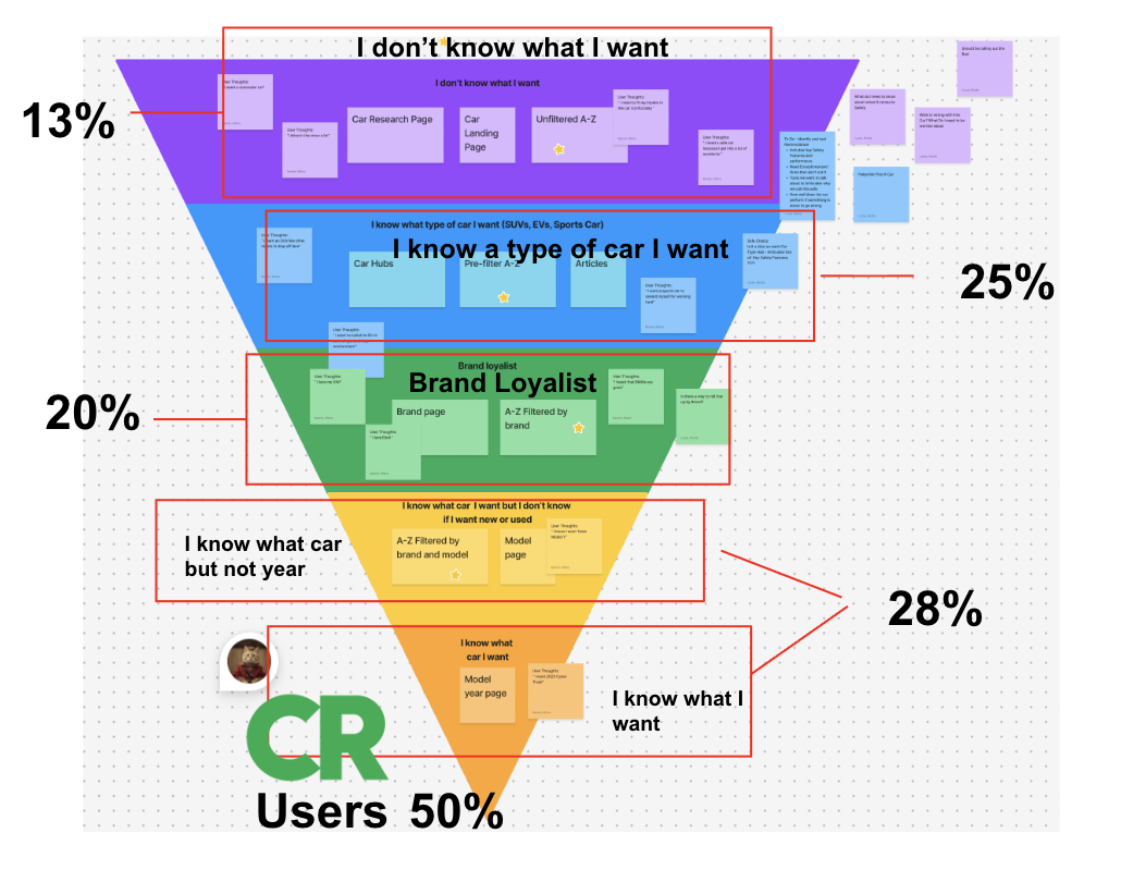
Key Findings
Our research consisted of a comprehensive survey conducted with 5,000 participants, revealing the following insights about non-member car shoppers:
13% of car shoppers do not know what they want.
25% have a specific type of car in mind.
20% are brand loyalists.
28% know the make and model they desire, including those who have specified whether they want a new or used vehicle.
In contrast, a noteworthy 50% of CR members arrive at the site already having a specific make, model, and year in mind.
Validation of Proto-Personas
Before my involvement, the team had developed proto-personas aimed at representing the different types of car shoppers. To ensure these personas were accurate and reflective of real user behavior, I proposed conducting an additional survey with 1,000 participants. The results were unexpected - rather than validating the proto-personas, the research indicated that most shoppers engage in the car research process in a similar way. This insight led us to scrap the previously identified personas in favor of focusing on the confirmed shopper funnel, allowing us to design with a more unified approach.
These findings indicated a significant opportunity better to serve the undecided shopper segment; particularly notable was that only 1% of CR members identified as unsure about their preferences. This gap in the market highlighted a need for targeted resources and engagement strategies aimed at those who are still in the exploratory phase of their car shopping journey.
Usability Testing
Throughout the design process, we conducted multiple rounds of usability tests, including concept testing. These tests were invaluable in gathering feedback on our designs, ensuring that we remained aligned with user needs, and refining our approach based on real-world interactions with our prototypes. By focusing on the confirmed research insights and user feedback, we aimed to create a more effective and user-centered Car Research page that addresses the unique needs of various car shoppers.
Solution
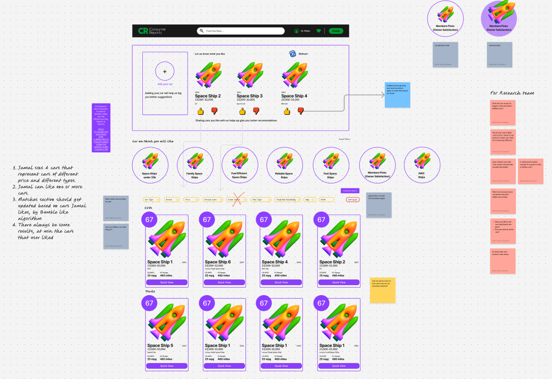
Solution
In the solution phase of our UX project, my team utilized a design project template I developed in FigJam, which served as both a guide and a resource throughout our process. This template documented our UX methodology and provided designers with useful starting points and templates tailored for each step of the design process.
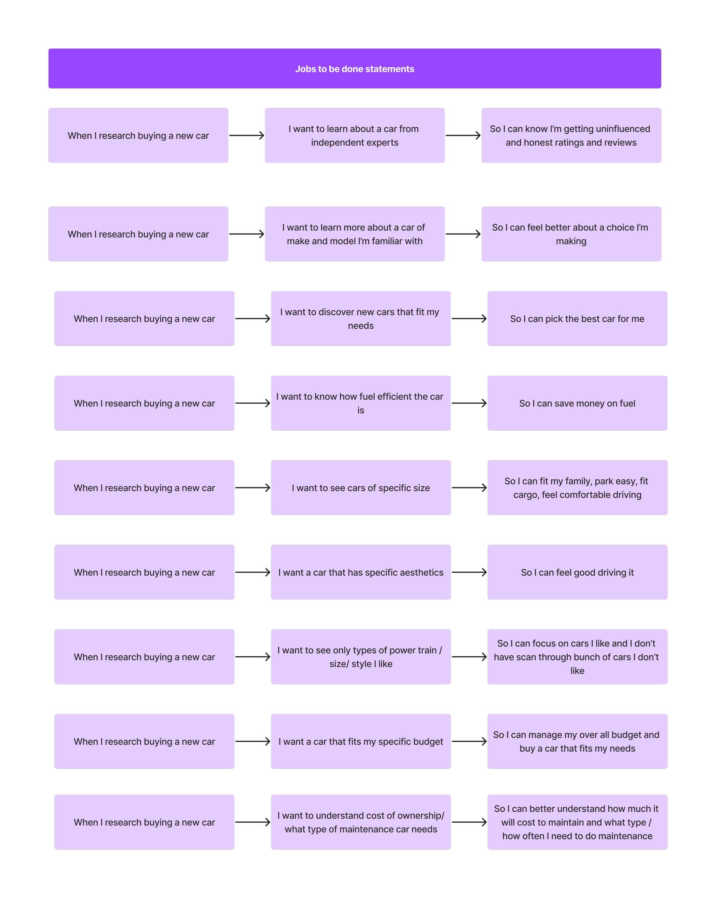
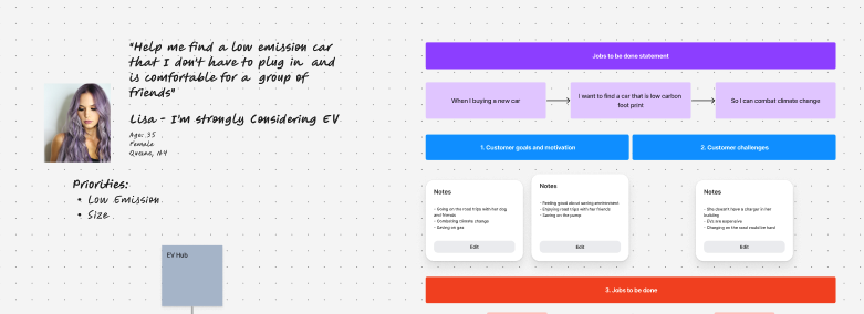
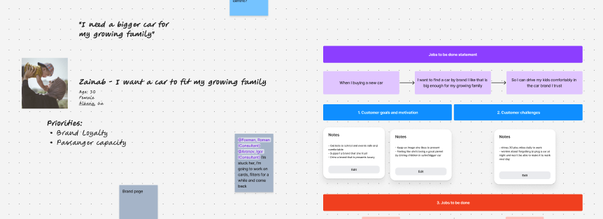
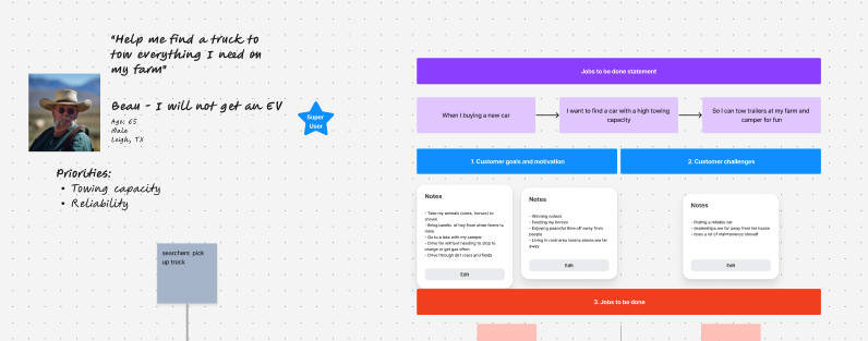
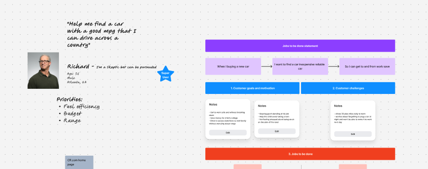
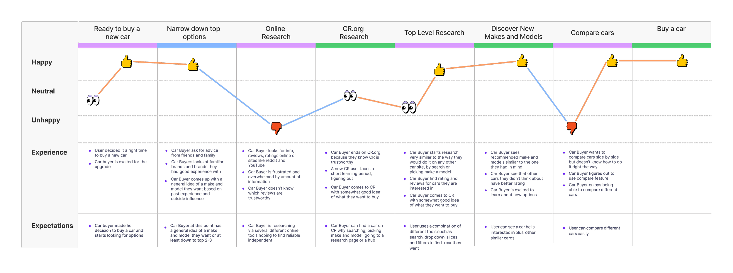
After thorough analysis of our user research, we identified the Jobs-to-be-Done (JBTD) for users engaging in car research. This foundational understanding allowed us to create detailed journey maps, highlighting key areas of opportunity for enhancing user experience.
To foster collaboration and harness a wider range of ideas, I recommend that designers run several ideation workshops involving not only our design team but also developers and stakeholders. This inclusive approach ensured that diverse perspectives were considered, allowing us to derive innovative solutions. Following these sessions, we prioritized ideas using a matrix that helped us identify the most promising concepts.
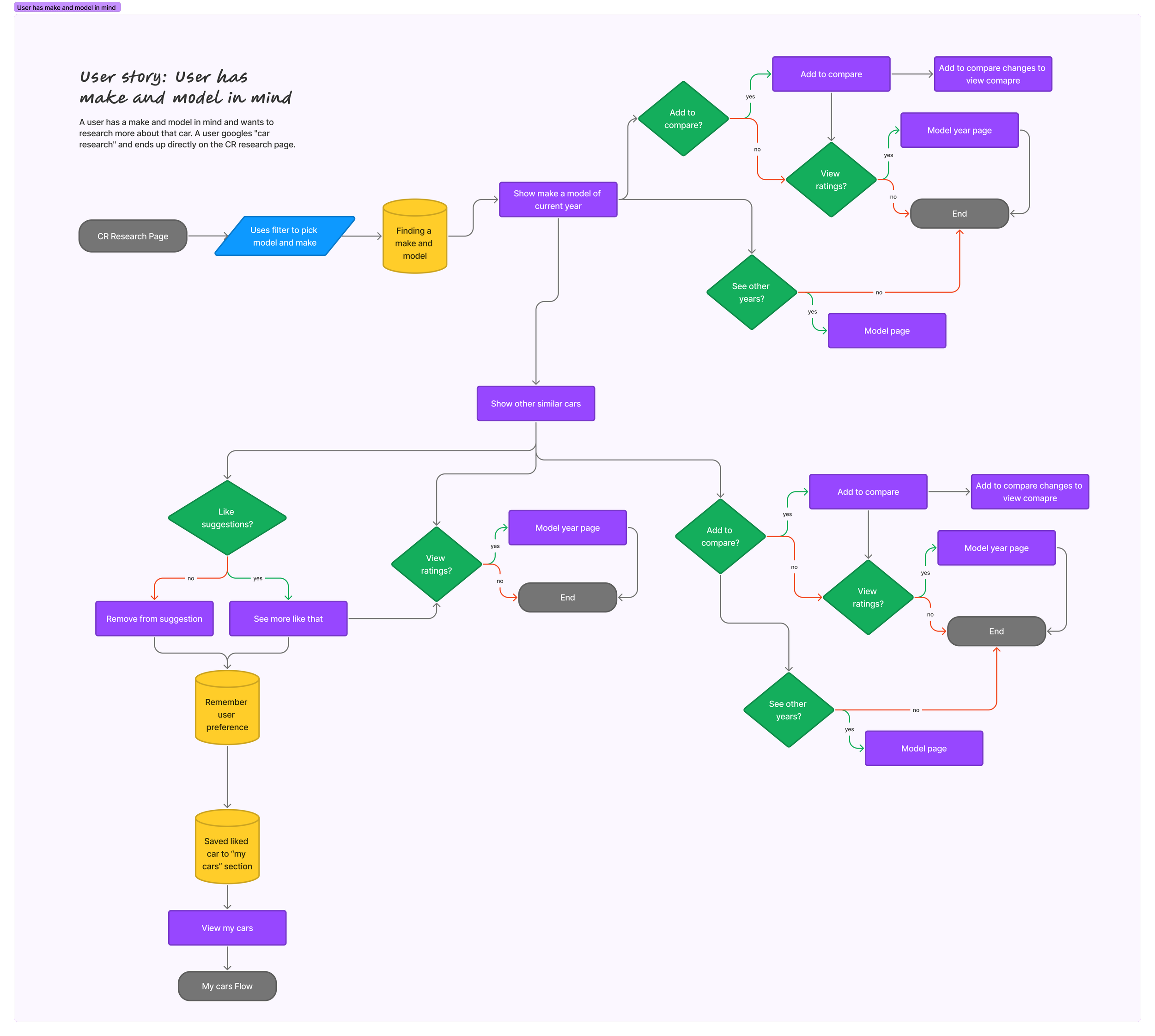
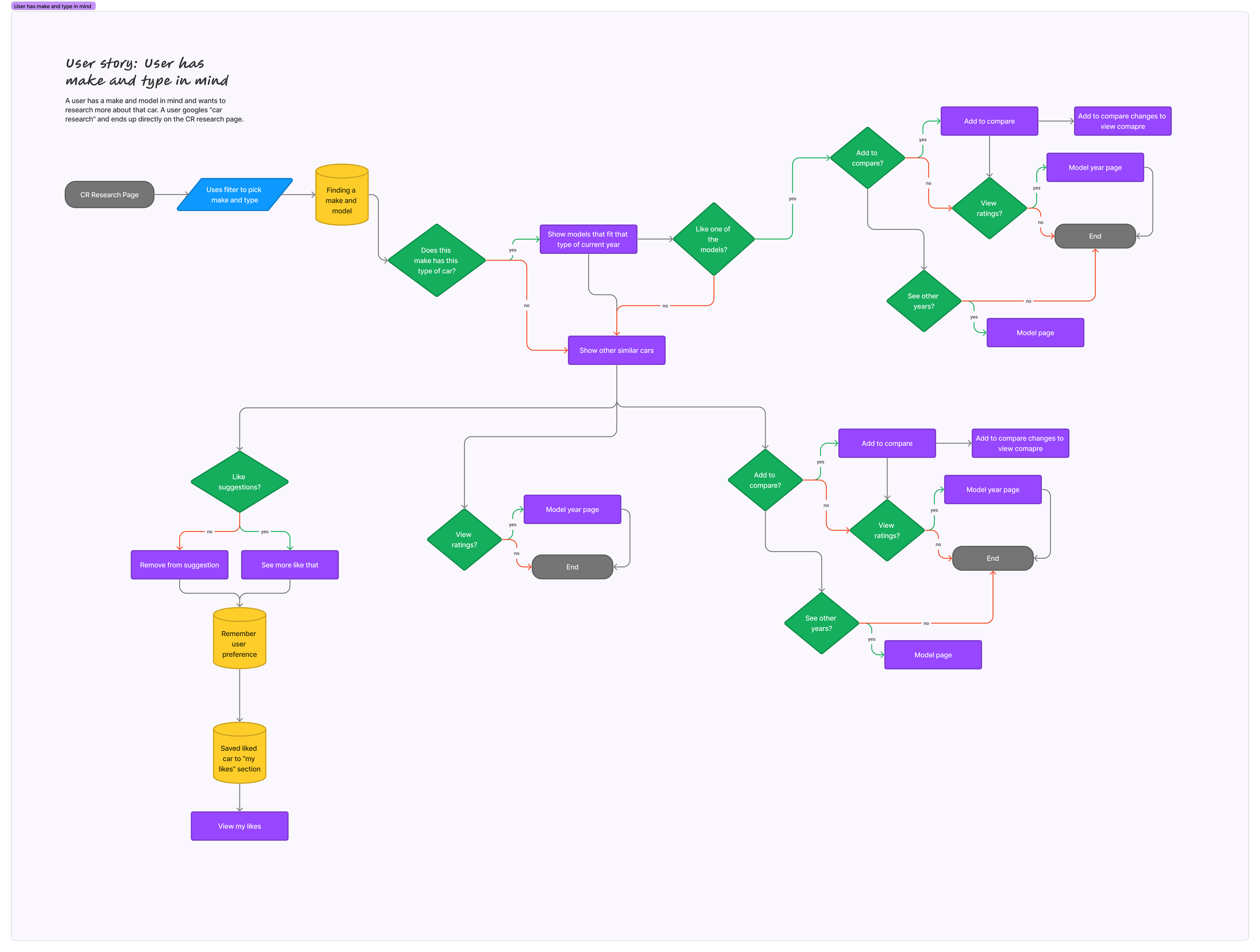
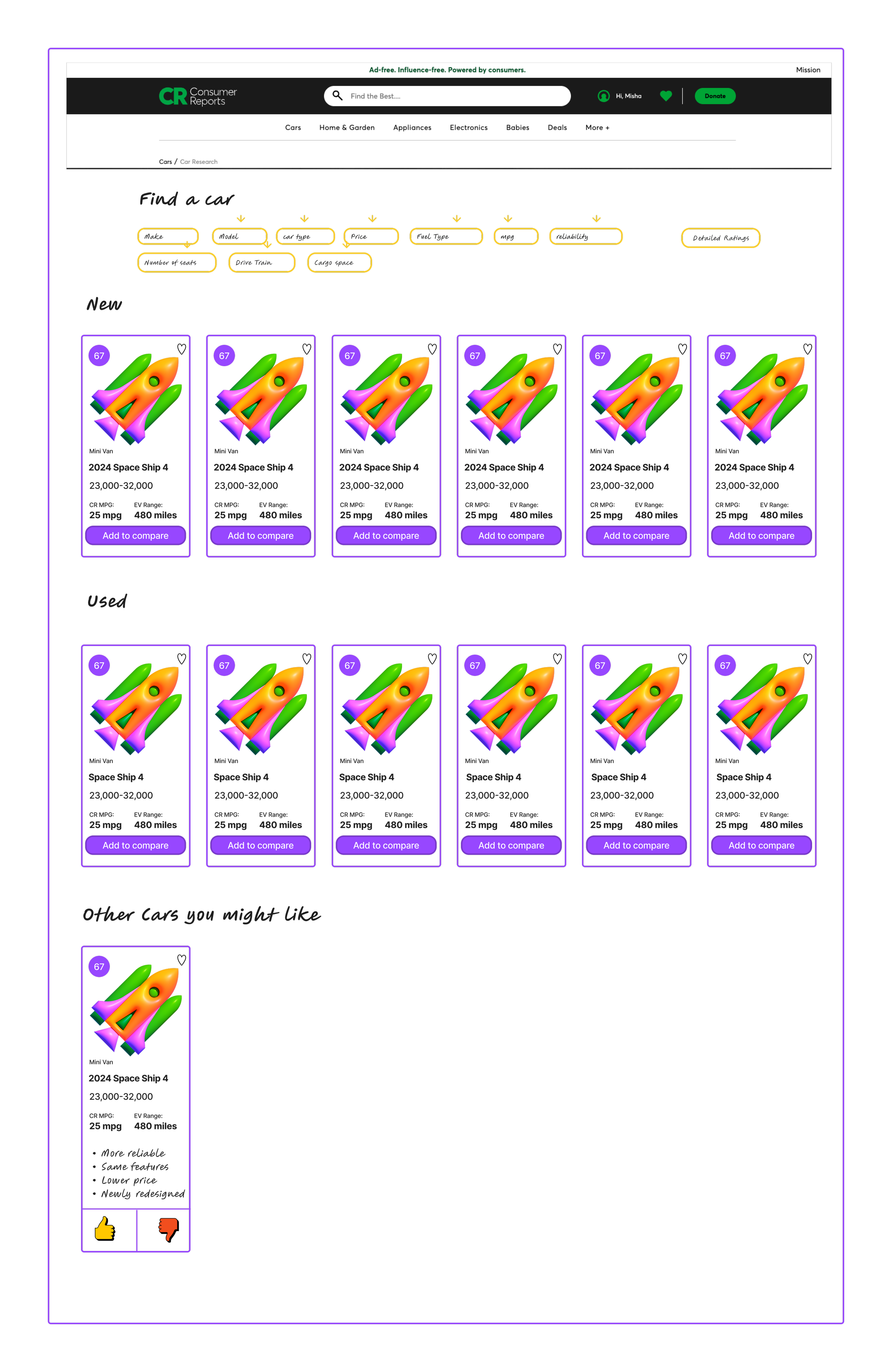
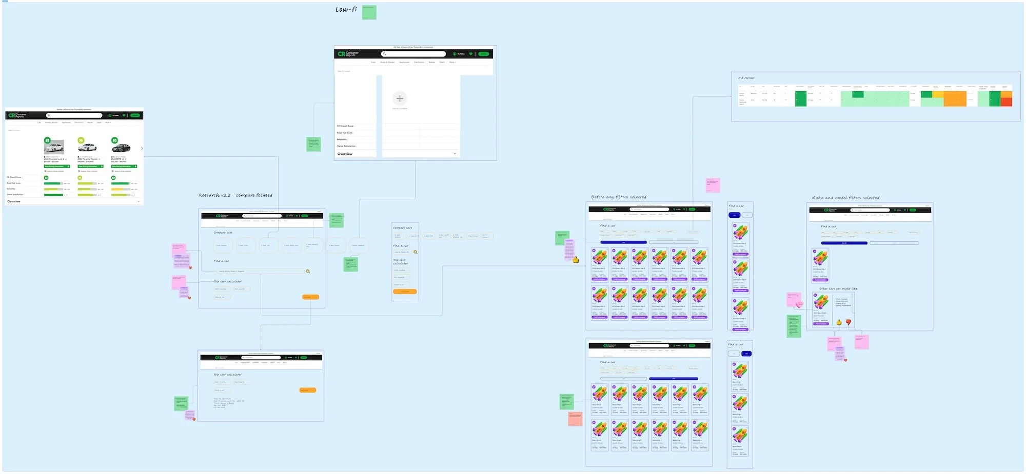
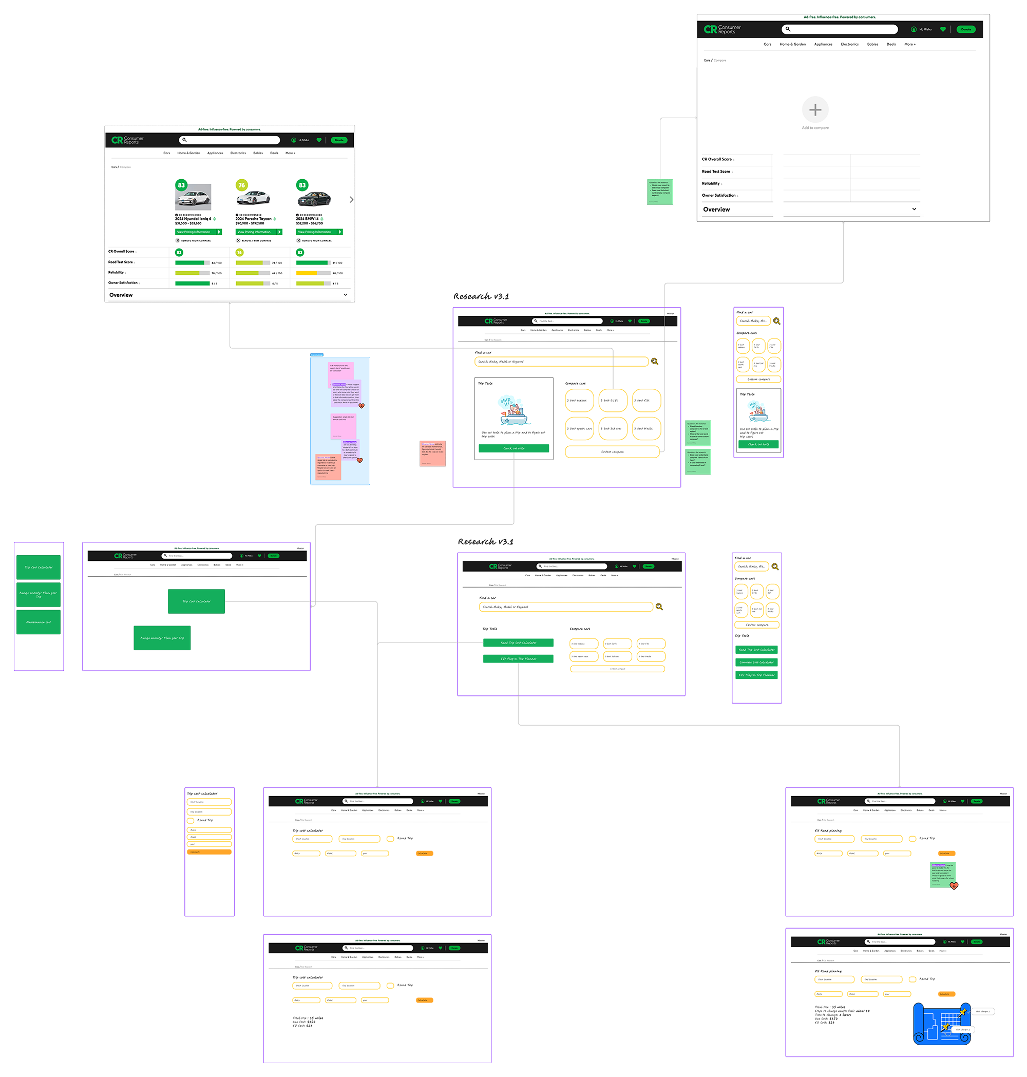
Our design team then developed a series of low-fidelity mock-ups and user flows, which we put through rigorous concept testing. An essential guiding principle was to design an experience that complements the existing user journey without overwhelming it.
We emphasized clarity and simplicity in our designs, as sometimes the simplest solution is the most effective. Through concept testing, we gleaned valuable insights, discovering that users resonated the most with cars displayed in the most popular order and filters that helped them narrow their options.
Outcome
The launch of the revamped Car Research page yielded impressive results in the first month.
We observed a remarkable 245% increase in time spent on the page.
Member interactions surging by 475%.
Non-member interactions rose dramatically by 852%, largely attributed to our strategic decision to place essential filters before the paywall while keeping ratings hidden. This move proved effective in driving engagement and attracting a wider audience.
Additionally, overall visits increased by 11%, and we saw a growth of 7% in new memberships. These outcomes underscore the success of our approach and the importance of aligning design solutions closely with the needs and behaviors of our users.